


SM—Guide: Building Artist Aura | Part I
A Guide to Building a Creative Following in the Modern Age


Welcome to the first edition of the SM—Guide: a space where we slow things down a bit. Think less trend report, more creative field manual for the modern age. Each episode is a deep dive into the ideas, strategies, and undercurrents changing the way the creative class operates today. Whether you're an artist, designer, or somewhere in between, this series will begin to unpack what actually matters when building a contemporary creative practice today. Follow us on Instagram and LinkedIn for more content and consider becoming a paid subscriber to Social Medium to receive full access to our platforms.

Sitting here in front of our laptops, floating somewhere in the SM multiverse, it’s been hard for us to admit: we probably don’t have it… That enviable sense of cool that radiates from your favourite artist. Think Basquiat’s paint covered Armani suits and nappy hair or Mick Jaggers f*ck you, pin striped attitude – it is this aura that defines the greatest artists of our time and seeps deep into our collective cultural psyche. It is what we call The Artist Aura.
While, we don’t foresee ourselves walking up to our next client presentation dressed in a nudie suit and smoking a cigarette in the near future, we have come to the realisation we understand how it works. We’re both obsessed with it, and we always have been.
We’ve spent our careers to date studying artists practices and careers. From obscure painters to full-blown cultural icons. Getting nitty gritty about how they’ve curated their own gravity around themselves so strong it begins to distort reality. How people don't just buy their work, they believe in it and epitomize it. They take cues from their public personas and begin to embody them – dressing like them, quoting them in conversations and arguments. They project meaning onto every brushstroke, lyric or pixel.
This invisible force, this aura, isn’t magic, even if it feels that way. It's the product of deliberate choices, subconscious signals, and psychological architecture that most people don’t even realise they're walking through.
And that’s what this three part guide is about: not about teaching you to fake it, but showing you how to build it, how to create it for yourself and how to introduce it to the world. Intentionally, honestly and strategically without selling your soul to the corporate overlords.
Artist aura isn’t just about attention. It’s about presence. It’s about standing for something, and making people feel that when they encounter your work, your name, or your image. So grab a pen and a glass of vino and lets begin…
Act I: Personal Brand

A Case Study: Grimes
Warhol had the factory, The Ramones had mops and leather jackets and Koons… well he has whatever he is doing, in many ways these feel like felt like obvious starting points for this dive into personal brand, but this time we're going to look at Grimes. Why? Because Grimes makes sense for the current moment — digital-native, platform-fluid, post-genre. Where Warhol had The Factory, Grimes has the internet – and she’s turned it into her own kind of myth-making engine.
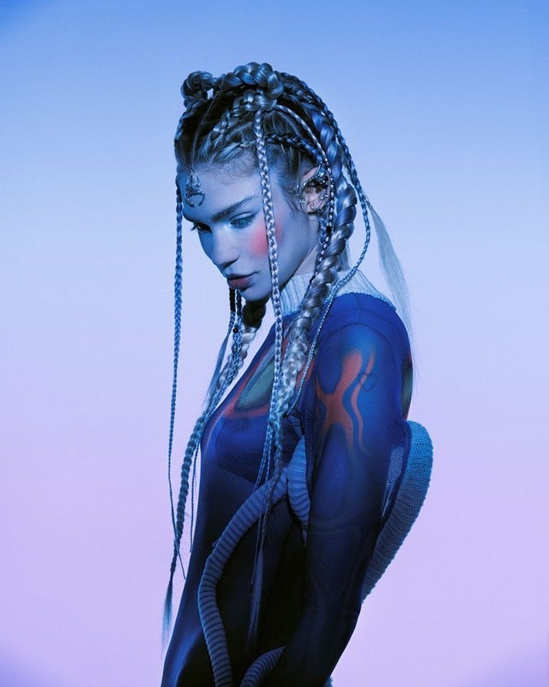
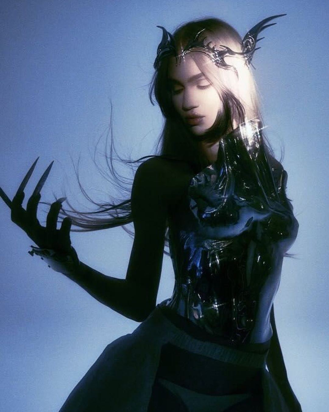
Originating from Montreal, Grimes isn’t just a musician, she’s a contradiction: part cyberpunk alien, part Tumblr-era DIY kid, part classical composer. She can talk about AI, anime, climate doom, and techno-utopias without it ever feeling forced. She’s not chasing an aesthetic, rather building a world around herself feels less like a typical artist brand and more like a layered labyrinthed world of techno, hair dye and feminist ideology. So lets break it down:
Visual Identity
Some artists have a uniform: items or codes so synonymous with that person they become short hands for their work. But in the case of Grimes, no look is the same, taking it beyond a simple wardrobe, they become coded symbols for the world she is building.
Her visual identity isn’t built around repetition — it’s built around evolution. Every wig, contact lens, and prosthetic pregnancy belly feels like an update in an ongoing software patch. One week she’s a cyberpunk elf, the next she’s a medieval warlock on a tech startup panel. She doesn’t just adopt aesthetics, she mutates them and fuses them, making you never sure whether it’s cosplay, prophecy, or a moodboard from 2078 — and that’s the point.
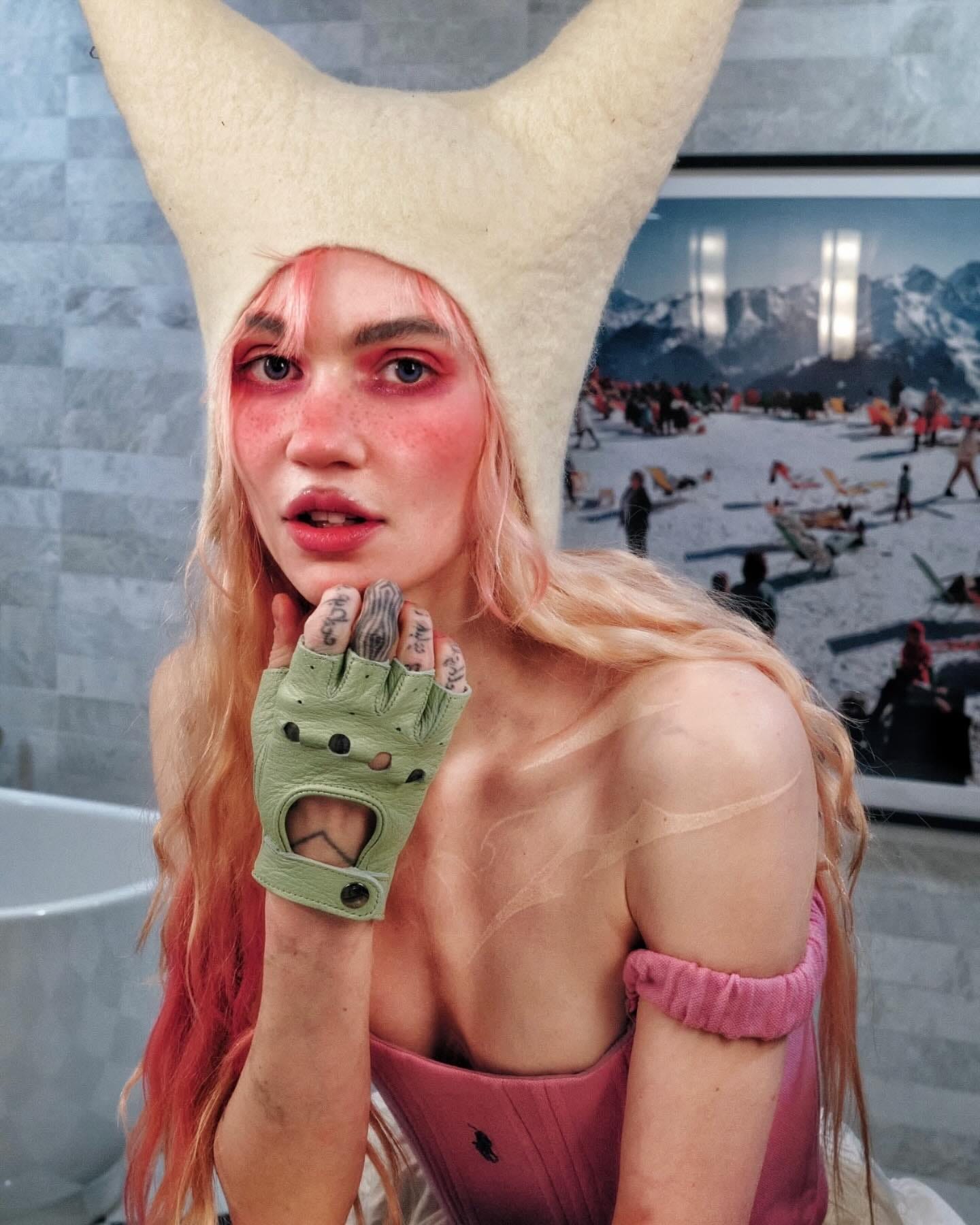
She knows that visual language is the fastest way to signal ideology, tribe, and intent. That people will project meaning onto whatever’s in the frame — especially if it’s unfamiliar. She’s mastered the semiotics of confusion, using it to create space for speculation, obsession, and fandom. In a world where everyone’s trying to go viral, Grimes is busy worldbuilding.
Narrative Control
Grimes leans into contradiction and chaos. She’ll go from quoting obscure economic theory to talking about sword fighting in the same breath — and somehow it makes sense. One minute it’s AI ethics, the next it’s a shitpost about goblins. Her interviews are less media-trained soundbites, more stream of consciousness dispatches from a parallel reality. And it works. Because unpredictability is a kind of authorship she has been able to control the narrative around her brand for better and for worse.
In a world obsessed with relatability and clarity (shout out all our brand strategists reading) Grimes does the opposite. She invites confusion. She makes ambiguity part of the brand. She gives you fragments and lets you decipher the meaning.
This form of co-authorship – when people start interpreting you like art – they stop thinking of you as just a person. You morph into something symbolic and this builds loyal followings. In short: she doesn’t clarify, she complicates. And that’s the magic trick. In an age of overly explained everything, she leaves space for speculation. Space that fans, critics, and algorithms rush to fill.
And don’t be mistaken, she’s not always in control of the narrative. But she understands the value of appearing like she is. She moves fast, breaks her own continuity, and stays just outside the boundaries of categorisation straddling the line between persona and person and genius and absurdity.
Platform Fluidity
Being a successful creative in today’s age is often a combination of being on the right platform at the right time, finding a niche and consistently exploiting it and being culturally attuned to new trends and what the audience is craving.
However, Grimes breaks this convention. She doesn’t just exist on platforms, she’s everywhere, but never in the same form twice. SoundCloud-era Grimes was lo-fi, witchy, and buried in reverb. Twitter Grimes was chaotic genius meets reply-guy bait. On TikTok, she’s a techno-elf preaching about AI and the end of civilization. In gallery shows, she’s a fine artist. On Discord, she’s a cult leader and in music videos, she’s not even human anymore.
And what makes it work is that she doesn’t try to translate herself identically across each space. She lets the medium mutate the message. She knows that each platform has its own language, tempo, and ecosystem — and she speaks to them all fluently. Instead of resisting fragmentation, she leans into it, building a brand that feels everywhere and nowhere at once.
This fluidity is what makes her resonate with a digital-native generation. As much as a manager would lead you too believe, the audience that doesn’t care about “platform strategy”. It is obvious when an artist has a team of people managing their socials as if each post or written word is a PR nightmare waiting to happen. People like authenticity and fans like the unexpected. So before you throw that next post on TikTok or Twitter think about the language of that platform and how you can adopt it.

Grimes isn’t confined by the idea of being a musician, or a creator, or a personality. She’s opted into a more interesting role: not a neatly branded PR package, but a living, evolving myth that changes depending on where you encounter her. And in a culture that values viral moments and platform presence over permanence, that’s not just smart — it’s essential.
Values & Alignment
Now whether you love or hate her Elon-era choices, she taps into big ideas: transhumanism, environmentalism, dystopian optimism. She wraps her art around philosophies, which gives her brand depth. Allowing people to attach to her world on a much deeper level, love it or hate it. And that’s rare. Especially in a culture where so much is filtered through irony, detachment, and brand safety.
Grimes gives people something to attach to. Not just aesthetically, but ideologically. Her work becomes a way for people to express their own obsessions, giving space for her audience to play with big concepts — often messy and often contradictory — but always expansive.
And this is key: people don’t build fandoms around content. They build fandoms around worldviews. Around shared language, shared values, shared weirdness. Grimes wraps her artistic output around a philosophical scaffolding and because of that, people don’t just consume it — they live in it.

So what’s the takeaway?
Your personal brand isn’t your grid, your font, or the outfit you wore to Frieze. It’s not how many followers you have or how consistently you post. It’s the impression you leave behind — the energy that lingers when your work is over and the tab is closed. Grimes reminds us that being an artist today isn’t about fitting into culture — it’s about bending it around you.
She doesn’t follow the rules yet every choice she makes reinforces the same gravitational pull. It doesn’t matter if she’s being brilliant or bizarre, online or offline, she’s always in character — even when the character is changing. And that’s the trick. It isn’t about perfection, polish, or even clarity. It’s about presence, a belief (perceived or real) and a point of view so unique it turns into a kind of magnetism.
In a time where everyone is producing content, what people are actually looking for is something real. Someone who makes the world feel a little bigger, a little stranger and a little more worth paying attention to.
Build that — and the rest will arrange itself in your gravity.
Act II: Signature Style

While Grimes is a shapeshifter – shapeshifting through wigs, lyrics, clickbait memes, and social platforms – not every artist works like that. Her brand isn’t built on consistency, but rather it’s built on momentum. Her style feels less like a fingerprint and more like a glitch in the feed. And yet, somehow, it still reads as recognisably Grimes.
However, some artists prefer to go the other way. Instead of mutating between every encounter, they double down. They dig a trench and keep digging. They refine one point of view until it stops looking like repetition and starts looking like a work of genius. And that’s what this chapter is about.
It’s about choosing your lens and committing to it until people stop asking why. It’s about doing something so deliberately, over and over again, that it becomes undeniable. And few artists demonstrate this better — or more successfully — than Juergen Teller and Ed Ruscha.

A Case Study: Juergen Teller
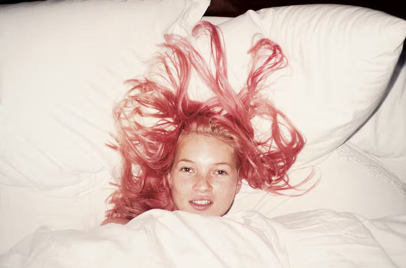
Some artists reinvent how we see the world, but Juergen Teller built a career by refusing to look away from what was already there — he made awkwardness iconic, turned rawness into something seductive, and shot celebrities with the same flat, indifferent gaze he used on himself, naked in hotel rooms with nothing to hide and nothing to prove. His work is punk not because it borrows the look of punk — no ripped collage, no gritty grain — but because it rejects polish entirely; it doesn’t perform, doesn’t persuade, it just holds your stare and dares you to keep looking.
From Marc Jacobs to Vivienne Westwood to Victoria Beckham stuffed into a shopping bag like a glamorous hostage, Teller has never bent to the fashion system — the system bends around him — and the genius isn’t just in how the photographs look but in what they insist on, which is that glamour is always a kind of illusion and that realness, when it’s unflinching, can be its own form of power.
Visual Style
Teller’s style runs on friction — he isn’t chasing elegance, or technical perfection, or even beauty in any conventional sense; he’s chasing something messier, something truer, or at least something that can pass for truth in a world built on performance. His images are raw and confrontational, lit with harsh flash and framed without mercy — flat, direct, and often brutally unflattering. Skin is left mottled, eyes half-closed, expressions caught just a beat too late. There's no romance, no polish, just the blunt reality of the moment.
He doesn’t correct angles or reach for flattering lenses — there’s no soft light sculpting your face into a dream version of itself. Instead, you get Kate Moss slumped in a corner, Marc Jacobs staring blankly, Victoria Beckham folded into a shopping bag like fashion’s punchline. It’s strange, a little absurd, sometimes even grotesque — and that’s exactly the point. Teller takes the fashion image and turns it inside out, stripping away the fantasy until what’s left feels less like advertising and more like a document of being alive, in all its awkward, unscripted weirdness.

What’s radical isn’t that it’s “ugly” — it’s that it refuses to perform. It doesn’t behave like a typical fashion image, no dream of youth, no glossed-over fantasy of luxury coaxing the viewer into aspiration or desire. Instead, it confronts. It shows what’s there. It stares back.
Teller’s aesthetic draws from the lo-fi immediacy of early zine culture and the anti-glamour impulse of punk, but never in a way that feels borrowed or imitated — there’s no staged chaos, no pretend grit, no post-produced grunge effect. Just the discomfort that comes when a camera doesn’t flinch, when someone looks too closely for too long with too much honesty. And the flash — harsh, unfiltered, inescapable — becomes more than a lighting choice. It becomes a presence in the image, a kind of psychological spotlight, revealing everything you’d usually try to hide.
Stylistic Impact
In a culture obsessed with filters, retouching, and perfect image control, Teller’s work reads like deliberate sabotage — a refusal to play along. He collapses the space between the polished and the pathetic, the untouchable celebrity and the everyday body in bad lighting. He makes you look at fashion’s most protected figures and think, unsettlingly, they don’t look that different from me.
But this isn’t chaos. It’s not accidental. The discomfort is intentional, the ugliness styled, the flash and flatness and awkward immediacy all part of a carefully constructed rejection — of taste, of glamour, of the unspoken rules about what deserves to be seen and how. It’s punk minimalism in the shape of a bad holiday snapshot, and that’s exactly why it hits so hard.

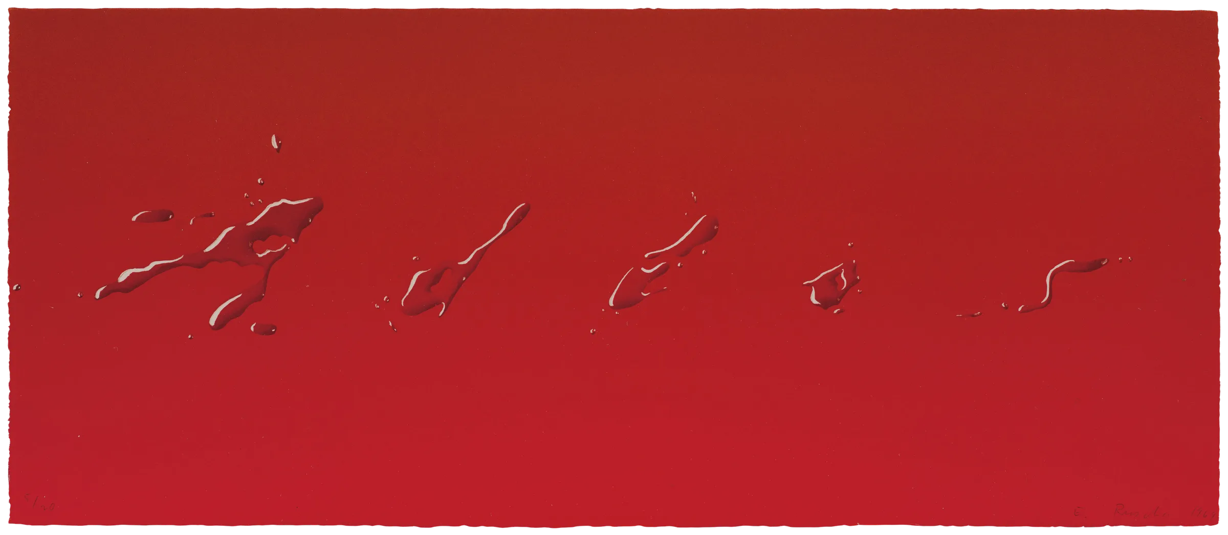
A Case Study: Ed Ruscha
Some artists shout, Ed Ruscha leaves a message.
A key figure in West Coast pop and conceptual art, Ruscha has spent over sixty years refining the art of restraint. While others filled their canvases with figures, metaphors, or abstraction, he chose sparseness. His paintings often contain nothing more than a few words, sitting quietly in space, refusing to clamor for attention. They linger in the mind like a half-seen sign on a highway — strange, dry, and impossible to forget. Where Warhol amplified image into noise, Ruscha distills language into something closer to a murmur — part prophecy, part non sequitur, hovering in a dreamlike vacuum that resists clear meaning.
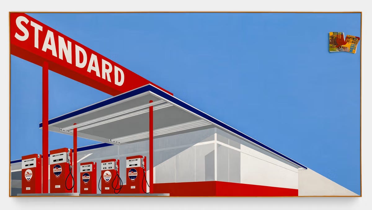
His most iconic works aren’t visual spectacles. In the ’60s, he gained attention photographing gas stations, and over time became known for paintings that carry just a word or two: “OOF.” “Pay Nothing Until April.” “Annie.” Flat statements that feel like cultural residue, as if pulled from a billboard, a daydream, or the back of your subconscious.

Rather then chasing draftsmanship or reductionism he renders his work in clean block letters. Positioned like a billboard and delivered with the deadpan timing. Ruscha doesn’t work in spectacle like much of his contemporaries — his genius is knowing that in a culture addicted to content, the most radical thing you can do is not say too much.
Visual Style
Ruscha’s style is all about stripping things down. He works more like a poet or a signwriter than a painter — compressing thought into a kind of visual haiku. The phrases he uses — “OOF,” “Cold Beer Beautiful Girls,” “Pay Nothing Until April” — feel pulled from the noise of American life: billboards, strip malls, matchbooks, parking lots. But once isolated on canvas, they shift. They stop selling and start lingering, taking on a weird kind of weight. Ruscha turns the leftovers of consumer culture into flat, bone-dry poetry.
His work nods to graphic design but refuses to follow its rules — there’s no push, no hierarchy, no visual funnel telling you what to think. Instead, it just sits there, blank-faced, waiting. The paintings don’t instruct or explain. They hover somewhere between a metaphor and a mistake, leaving the viewer caught in that uncertain space.

What Makes It Work
Ruscha’s genius is in what he leaves out. He doesn’t crowd the canvas or spell things out — he leaves space, and trusts you to meet him halfway.
That’s what gives his work its echo. When you strip something back to almost nothing, whatever remains has to do all the heavy lifting. A single word becomes loaded, a typeface starts to speak, a painted sky can suddenly feel like a stand-in for everything you can’t quite name — boredom, longing, the weird emptiness of America.
He’s not inventing new images. He’s taking what’s already out there, gas stations, parking lots, ad slogans, and showing them back to us with just enough distance to make them feel unfamiliar again. The ordinary becomes eerie, his paintings feel less like pictures and more like sentences, but ones that never fully resolve.
And over time, all these minimal, almost-too-simple gestures start to stack up. Like Katz’s deadpan faces or Teller’s unforgiving flash, Ruscha’s repetition becomes its own language. Each piece feels like another page in a long, quiet novel about America, signage, surface, and solitude.
He’s not trying to capture moments — he’s building an atmosphere.
Cultural Context
To understand Ruscha is to understand a particular version of America — postwar, car-focused, full of billboards and endless highways. The kind of place where everything spreads out instead of stacking up. LA in the 1960s wasn’t like New York. It was flat, sprawling, shaped by signage, real estate, movies, and illusions. That’s the landscape Ruscha made his own.
He came up around the same time as the Light and Space artists like James Turrell and Robert Irwin, who were using light and perception to explore how we experience the world. But while they were letting images dissolve, Ruscha held onto them. His minimalism wasn’t about sleekness or purity. It was about saying just enough to spark a thought, but not so much that it gave you the answer.
His influence is everywhere — in the work of Barbara Kruger, John Baldessari, Raymond Pettibon, and in brands trying to tap into a certain dry, ironic version of Americana. You can feel him in moodboards, in ad campaigns, in carefully art-directed music videos. But very few get the tone right. Because what seems simple in Ruscha’s work is actually very carefully balanced. It’s minimal, but not cold. Poetic, but not soft. Conceptual, but still grounded.
So what’s the takeaway?
Signature style isn’t about decoration. It’s not something you add at the end — it’s something that builds over time through repetition, restraint and refusal. It’s not just how your work looks. It’s the shape of your thinking showing through, again and again, until people start to recognise it.
Teller builds his style by showing too much, flash, flaws, awkwardness. Ruscha does the opposite, space, silence, suggestion. One bends beauty out of shape and the other boils meaning down to the bare essentials.

Neither chases trend, but both trust the viewer to feel their intent before they fully understand it. Lasting style doesn’t shout, it holds its ground. It comes from a point of view, not just a design choice and that’s what makes it memorable and that’s what makes it stay.
When your work leaves a trace without needing to explain itself, you’ve stepped into authorship. The work gets their attention, the myth keeps them coming back.
Incase You Missed It:


Well, that’s it. Acts I and II, done and dusted…
We’ve looked at personal brand, how artists like Grimes bend the internet around themselves and turn chaos into coherence.
We’ve explored signature style, how Teller and Ruscha built unforgettable visual identities not by doing everything, but by doing something over and over with total commitment. Now we move into deeper terrain: Part II.
Coming up in the coming weeks:
The Myth of the Artist
Mystique vs. Transparency
This is where the work stops being just visual, and starts becoming felt.
Ciao! See you there.
For Everyone (On + Offline)